(Stephen C. Miller) Are we on the verge of a second wave of coronavirus infections? Is there a spike in infections in states that reopened first?
Source – American Institute For Economic Research
by Stephen C. Miller, June 16th, 2020
The only way to answer that question is to watch as the data roll in. Arguably the best data to look at to see if a second wave is beginning are the hospitalization numbers. The media frequently reports the biggest and most dramatic numbers, often devoid of context. The number of cases has been reported regularly since the early days of the pandemic, and yet we know that the number of cases can be misleading.
As more people are tested and re-tested for the virus, more results will come back positive, with the current number of confirmed cases exceeding 2 million in the U.S. But if we know anything, it is that increases in the number of confirmed cases do not accurately convey how quickly and widely the virus is spreading. Antibody tests and even the examination of sewage in some cities suggest that the number of infections is likely much higher than the number of confirmed cases.
But on the other side, some of the confirmed cases are double-counted in some states partly because both antibody and active virus tests are being counted separately but then combined in the total number of cases. While the antibody tests have been criticized for their false positive rate, another criticism has been that the antibody studies can underreport infection rates because they are not sensitive enough to detect a past mild infection.
Overall, because the bulk of testing is focused on people who are the sickest and who face the greatest exposure, it seems reasonable to conclude that the true number of U.S. infections is substantially higher than the reported figure. But an attempt to estimate the true number of infections would be little better than a guess.
And this presents a problem with the daily updates. To say that a particular state or city is seeing a “spike” in cases is to say that recently they have had an uptick in positive test results. That could be due to more testing and more ways of testing, or it could be a hint of growth in the infection rate.
Better Data are Available
Rather than focus on test results, i.e. “cases,” it would make more sense to focus on how the virus affects society and our institutions, particularly the strain the virus puts on health care facilities and health care providers. An obvious measure, tracked since the beginning of the pandemic, is the number of deaths. As I and others at AIER have noted, the number of deaths is hard to interpret without important context.
The coronavirus is obviously deadly, but how deadly it is seems to depend greatly on how it enters a population and the characteristics of that population. The virus has been far deadlier in New York than it has been in California, and has been most deadly in U.S. long-term care facilities. Among children, the coronavirus is considerably less deadly than seasonal influenza.
Nonetheless, deaths tell us something important about the virus’s impact on society. They profoundly affect entire social networks and are rightly emphasized in pandemic reporting.
When it comes to seeing how things are going now, whether the pandemic is growing worse or fading, deaths are a lagging indicator. They do not begin to spike until infections have already been accelerating rapidly for many days, and they do not decline until well after the virus’s spread has slowed.
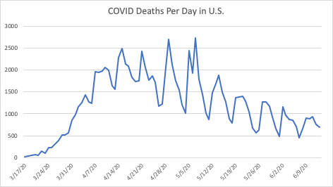
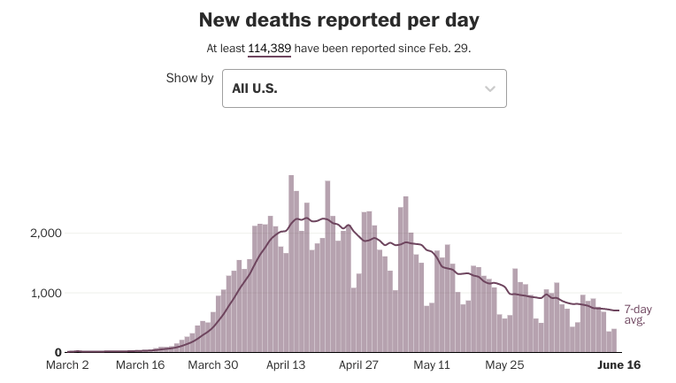
The chart below shows that overall, deaths are clearly declining, although there is a weekly cycle where Sundays seem to result in relatively low death counts and Tuesdays and Wednesdays usually have the highest reported numbers. Overall, the past two weeks have had lower death totals than have been seen in the two months prior. But if a second wave were coming soon, we would not see the deaths from it yet.

Here is another look from the Washington Post.

In addition to deaths, more attention has shifted to measuring coronavirus-related hospitalizations. Frustratingly, these data tend not to go back as far as numbers on confirmed cases or deaths, but in most states there are hospitalization figures going back over two months. The hospital data are measured two ways, the first being a cumulative measure, similar to the way confirmed cases and deaths are measured.
The number can only go up as more hospitalizations are added to the total. From that number, the daily number of hospitalizations can be plotted; however that number is very noisy because the numbers are submitted at the state level in a variety of ways and do not seem to reflect the true numbers per day.
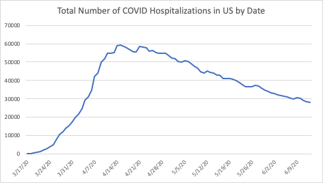
In other words, the hospitalization numbers seem to come in in clumps. They can be reported as weekly totals or weekly averages, as well. But a weakness of the cumulative data is that they do not tell us much about the burden on hospitals and health care workers. The total number of coronavirus hospitalizations increased dramatically, from zero to nearly 60,000 in a month nationally, and stayed high for weeks afterward. The chart below shows that the decrease in hospitalization has been fairly steady, and overall there is far less strain on the health care system than there was in mid-April.
Book Climate of Corruption: Politics and Power Behind The Global Warming Hoax

The northeastern U.S. was hit hardest, but most states are either seeing declining or flat trends in hospitalizations, with a few notable exceptions such as North Carolina, Texas, and Arizona. But in those states the number of hospitalizations is still relatively low, a fraction of the totals that New York and New Jersey were seeing in April. Claims that Alabama, Georgia, and Florida are emerging “hotspots” are not supported by the hospitalization numbers despite media reports to the contrary.
There are some parts of the country still in the midst of the first wave of coronavirus infections, states that had very low numbers of hospitalizations and deaths in April, but are now beginning to see the virus spread more quickly. But those states are unlikely to see the kind of spread Northeastern states did, and there is hope the virus can be far less deadly going forward if policies can be implemented to better-protect the elderly and vulnerable, especially those living in long-term care facilities.
About The Author
Stephen C. Miller is the Adams Bibby Chair of Free Enterprise and an Associate Professor of Economics in the Manuel H. Johnson Center for Political Economy at Troy University. He is also an AIER Summer Fellow alumnus and Voting Member of AIER. The views and opinions expressed are those of the author and do not imply endorsement by Troy University.
Stillness in the Storm Editor: Why did we post this?
The news is important to all people because it is where we come to know new things about the world, which leads to the development of more life goals that lead to life wisdom. The news also serves as a social connection tool, as we tend to relate to those who know about and believe the things we do. With the power of an open truth-seeking mind in hand, the individual can grow wise and the collective can prosper.
– Justin
Not sure how to make sense of this? Want to learn how to discern like a pro? Read this essential guide to discernment, analysis of claims, and understanding the truth in a world of deception: 4 Key Steps of Discernment – Advanced Truth-Seeking Tools.
Stillness in the Storm Editor’s note: Did you find a spelling error or grammatical mistake? Send an email to [email protected], with the error and suggested correction, along with the headline and url. Do you think this article needs an update? Or do you just have some feedback? Send us an email at [email protected]. Thank you for reading.
Source:
https://www.aier.org/article/what-spike-hospitalization-data-show-no-indication-of-a-second-wave/

Leave a Reply